Defold markdown test
All defold manuals and tutorials are written in Markdown. This document outlines how to use the various formatting for a consistent look on all documents.
Try to write as if you are talking to the user. Keep the language direct and active and refrain from stating opinions unless it is important to the matter. Try to write paragraphs that flow and do not break them unnecessarily.
You do have some typographic markers to your disposal. The simplest one is the emphasis marker. It puts some stress to a word, marking it as important. This marker should also be used to call attention to specific things that the user can encounter in Defold, like the names of properties, buttons etc. For example, a sprite component’s Position, a button that says Save… etc. File names are also typed like that: game.project or main/images/logo.png.
Do not use the bold text emphasis. Do not ever mark anything with both bold and emphasis.
Generally, when using quotes you can type straight quotes ("") and they get automatically converted to “nice typographically correct quotes”. Also, the en and em-dashes are nice things to be able to type easily. You do that by typing -- for en-dash and --- for em-dash. So now you can get nicely typeset numeric intervals like 23–24, and if you want an em-dash as punctuation in a sentence—that’s easy too. Just remember not to put spaces around them. A nice ellipsis character is also automatically inserted whenever you type more than two spaces in a row…
Keystrokes, like the combination ⌘ + T are written surrounded by <kbd> tags, as are any references to menu options, like File ▸ Save As.... Note the small right-pointing triangle that makes menu options stand out a little.
For subscript and superscript you type ~subscript~ and ^superscript^. For example: X~N~ = y^N^ + O~N~ where N is a variable. For clarity, maths formulas can be put inside <code> tags, or even better—use the LaTeX math extension. Inline math is written surrounded by $ signs. For instance, $\int\frac {d\theta}{1+\theta^2} = \tan^{-1} \theta+ C$. Separate math blocks are delimited by $$ pairs:
For things that the user will type, like function names, message names, string values and similar, use the code marker. For instance, go.some_function() or a variable name, a message_name or a "string value". For larger chunks of code or configuration text, use the code fences with language specification to enable syntax highlighting:
local pieces = { "ground0", "ground1", "ground2", "ground3",
                    "ground4", "ground5", "ground6" } -- <1>

function init(self) -- <2>
    self.speed = 6
end

-- This is a comment to the functionality of the function and it is running quite long to force a linebreak
function update(self, dt)
    for i, p in ipairs(pieces) do -- <3>
        local pos = go.get_position(p)
        if pos.x <> -228 then
            pos.x = 1368 + (pos.x + 228)
        end
        pos.x = pos.x - self.speed
        go.set_position(pos, p)
    end
end
-- This is a comment to the functionality of the function and it is running quite long to force a
- Note that the
-- <1>in the source is changed to a numeric callout that is not part of the source code anymore. - Depending on the source language you type the callout differently. In a C like language
you would type
// <2> - In a shell-like language you would type
# <3>.
Two levels of headings, lists and tables
Do not use more than two levels of headings. If you need to describe specific things that you feel call for a third level heading, use a definition list instead:
- Some thing
- Here you can explain what “Some thing” is, what it does and whatnot. You have access to all of markdown in the description, just make sure to indent properly:
- A bullet point
- Another bullet
- Another thing to explain
- Here you explain that other thing to explain. Try to be specific and avoid vague language when you describe things.
Definition lists are great when you can put a name to each item. Sometimes a bullet list is better, or a numbered list. You can mix and match these:
- Bullet list, indicated with either a
-or a*or a+at the start of the line. - Another item.
- A third item. We can also make sub-items, either bullets or numbers:
- A numbered sub-item. Number list items are written either
1.or1). - The numbers are increased automatically from the first one.
- A numbered sub-item. Number list items are written either
- A fourth bullet item. This marks the end of the list.
- Let’s create a numbered list that starts on the number 23.
- Another item. Note that this gets the number 24 no matter what I type.
- And this gets the number 25 no matter what I type.
Definition lists are good for free flow explanation of things. Sometimes a table would do the job better though. Left-aligned:
| Shortcut | Purpose | Context |
|---|---|---|
| F11 | Toggle fullscreen | In application |
| ⌘ + T | Open a new tab | In application |
| ⌘ + Shift + N | New incognito window | In application |
Or right-aligned
| Shortcut | Purpose | Context |
|---|---|---|
| F11 | Toggle fullscreen | In application |
| ⌘ + T | Open a new tab | In application |
| ⌘ + Shift + N | New incognito window | In application |
Notes and images
There are two types of notes that you can insert into the text. Since this is not a printed medium the idea of a footnote doesn’t really work. Instead we keep the notes together with the text. Use the <div class='sidenote' markdown='1'> block for these.
</div> sidenote
The <div class='sidenote' markdown='1'> block is good for adding footnote-like information to the text. It can be used to add further explanation that is not vital or point to other resources. They are shown to the side of the text they precede.
</div>
When you really want to make the user aware of something, use the <div class='important' markdown='1'> block:
</div> important This is a block of text that the user will not miss. Use these sparingly for things that really needs a lot of attention. If you find that your document is littered with these, you might want to group the information a bit. :::
Images are inserted into the document like this:
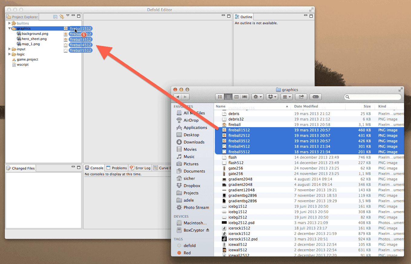
 An image that is put at the start of a paragraph—inline with a class
 .left. This is useful for small images like icons and the like. The rendering of these is not optimal since the image size is needed to figure out image placement in relation to the text. Still, in some cases it can be useful, for paragraph decoration or similar.
{.right} An image that is put at the start of a paragraph—inline with a class .right. This is useful for small images like icons and the like. The rendering of these is not optimal since the image size is needed to figure out image placement in relation to the text. Still, in some cases it can be useful, for paragraph decoration or similar.
![]() Images with class
Images with class .icon are rendered inline aligned with the text. Use this to insert really small images (like ![]() ) into running text.
) into running text.
Note that images are usually rendered centered in their own paragraph. Apply class .inline for inline behavior if you have several images as part of the same paragraph and you want to line up several images like this:
Transclusion
Pieces of text that are used in multiple places can be transcluded into a document. See https://github.com/jamesramsay/hercule for details on the transcluder plugin used.
This file can be used to test transclusion. This whole file will be transcluded as is, with whitespace preservation.
Note that any file references need are relative to the document where the file is inserted.
![]()
The end
- English
- 中文 (Chinese)
- Español (Spanish)
- Français (French)
- Νεοελληνική γλώσσα (Greek)
- Italiano (Italian)
- Język polski (Polish)
- Português (Portuguese)
- Русский (Russian)
- Українська (Ukranian)
Did you spot an error or do you have a suggestion? Please let us know on GitHub!
GITHUB